New logo, new website, printed brochure in hand… and readers tuning in from across the Atlantic. 🌍
It’s not a rebrand – it’s a launch into the water.

At AF Fluvial Conseil, everything is about course, rhythm, and movement.
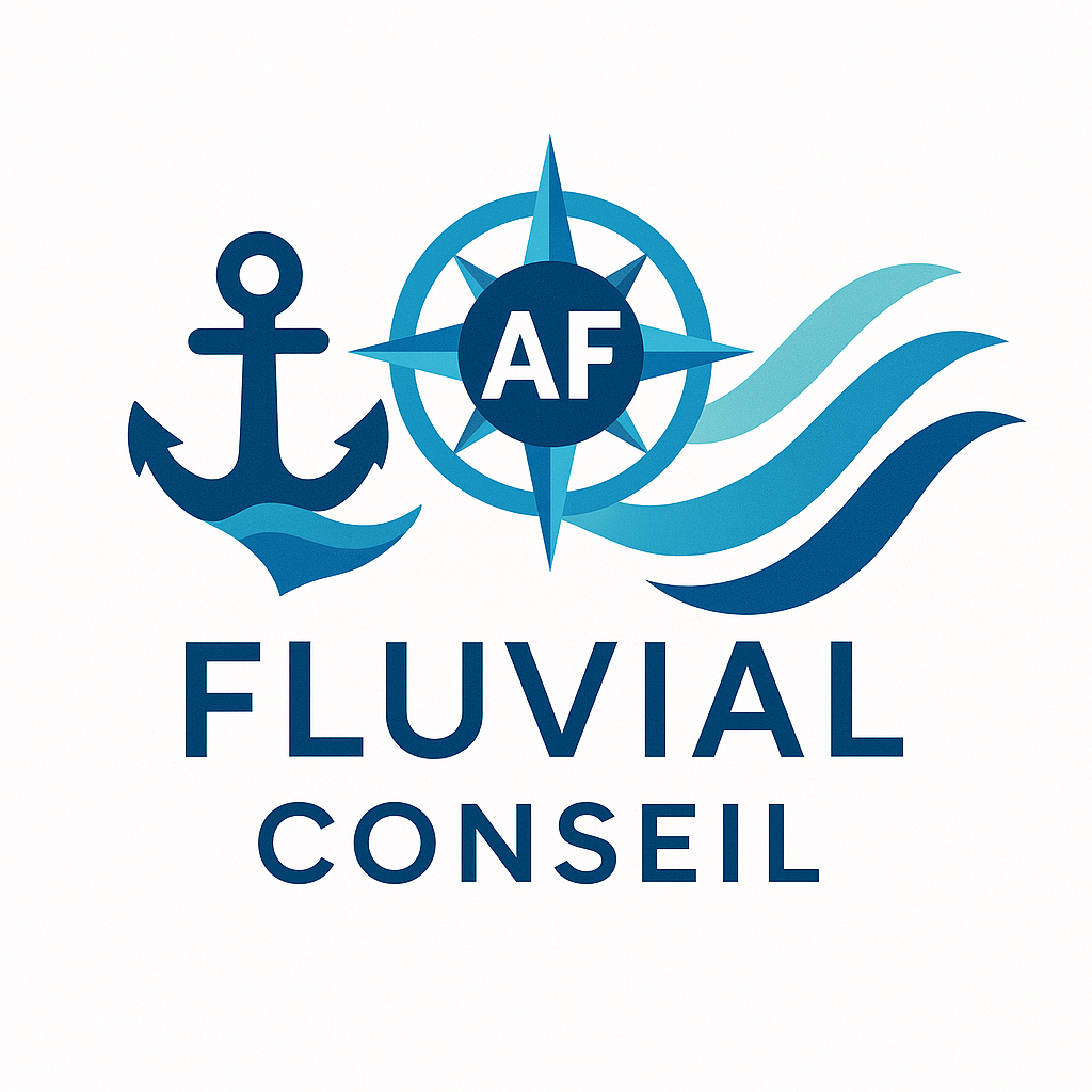
So it made sense to design an identity that reflects exactly that — anchored, fluid, and meaningful.
⚓ The anchor stands for reliability — the symbol of solid, hands-on support and the trust built with every destination I work with.
🧭 The compass represents vision — nearly twenty years of experience guiding river projects in the right direction.
🌊 The waves embody territories — always in motion, expressing adaptability, cooperation, and sustainability.
Each line of this new logo tells the story of what I do every day: connecting vessels, destinations, and projects.
🌐 A Website Open to the World
The new website was launched in July 2025 — and it quickly found its audience, with nearly 15% of visitors coming from the United States.
To meet this growing interest, the main pages have been translated into English, making it easier for international partners to connect and explore opportunities for collaboration.
👉 French river cruising intrigues, inspires, and travels.
📖 A Brochure That Brings You Back to the Quayside
Released in September, the new brochure completes the communication toolkit:
a clear, accessible printed document designed for real-world use — whether during the Tour de France des Escales, institutional meetings, or local workshops.
It’s one more step forward: from a digital showcase to a tangible presence — right on the quays.
💬 And always the same tone

genuine, human, and sometimes a touch ironic.
Because river cruising deserves to feel alive.
You can talk seriously without taking yourself too seriously.
Laisser un commentaire